The Income Trend Analysis chart is an excellent resource for the planning team when developing the credit union's long-term financial objectives. The chart helps you to analyze and compare major income trends.
All of the figures on the Income Analysis worksheet pull through from other data entry areas. No data entry is necessary in the Income Analysis worksheet.
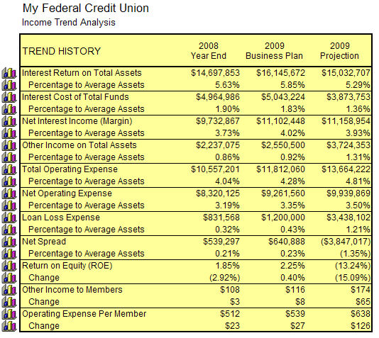
In the Income Trend Analysis chart, you can review Interest Return on Total Assets...
![]()
...Interest Cost of Total Funds...
![]()
...Interest Margin on Total Assets...
![]()
...Other Income on Total Assets...
![]()
...Total Operating Expense...
![]()
...Net Operating Expense...
![]()
...Loan Loss Expense...
![]()
...Net Spread...
![]()
...Return on Equity...
![]()
...Other Income to Members...
![]()
...and Operating Expense per Member.
![]()
Income Trend Analysis Chart Comparison Features
In the Income Trend Analysis chart, you can compare the credit union’s performance against national income data for credit unions of a similar size.
First, select the asset size you would like to use for comparison, by selecting the asset size from the drop down box on the right hand side of the chart.

Next, select the data which will serve as the basis for comparison - the last year’s ending data, current year-to-date data, the current year’s Business Plan data, or the next year’s Business Plan data (if entered).
![]()
Now, turn on the Comparison feature. The Compare off button is a toggle button. If you click on it, you will see ”Compare National” displayed.
![]()
Insight will then compare your credit union’s data to the National data for the Asset class you have selected.

Blue data indicates that this is an area where your credit union’s performance exceeds the national peer data. Red data indicates that this is an area where your credit union’s performance is below the national peer data.