In the Income Trend Analysis (IA) chart, you can compare your credit union’s performance against national income data for credit unions of a similar size.
First, turn on the Comparison feature. The Compare off button is a toggle button. If you click on it, you will see ”Compare National” displayed. Insight will then compare your credit union’s data to the National data for the Asset class you have selected.
![]()
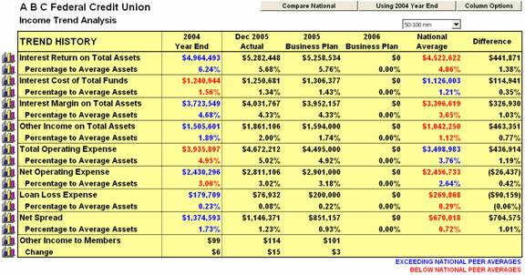
Next, select the data which will serve as the basis for comparison - the last year’s ending data, current year-to-date data, the current year’s Business Plan data, or the next year’s Business Plan data (if entered)
![]()
Blue data indicates that this is an area where your credit union’s performance exceeds the national peer data. Red data indicates that this is an area where your credit union’s performance is below the national peer data.
